Cana Care
Visual identity refresh
Cana Care approached me with an existing visual identity that needed to become more flexible, distinctive and adaptable across different touchpoints.
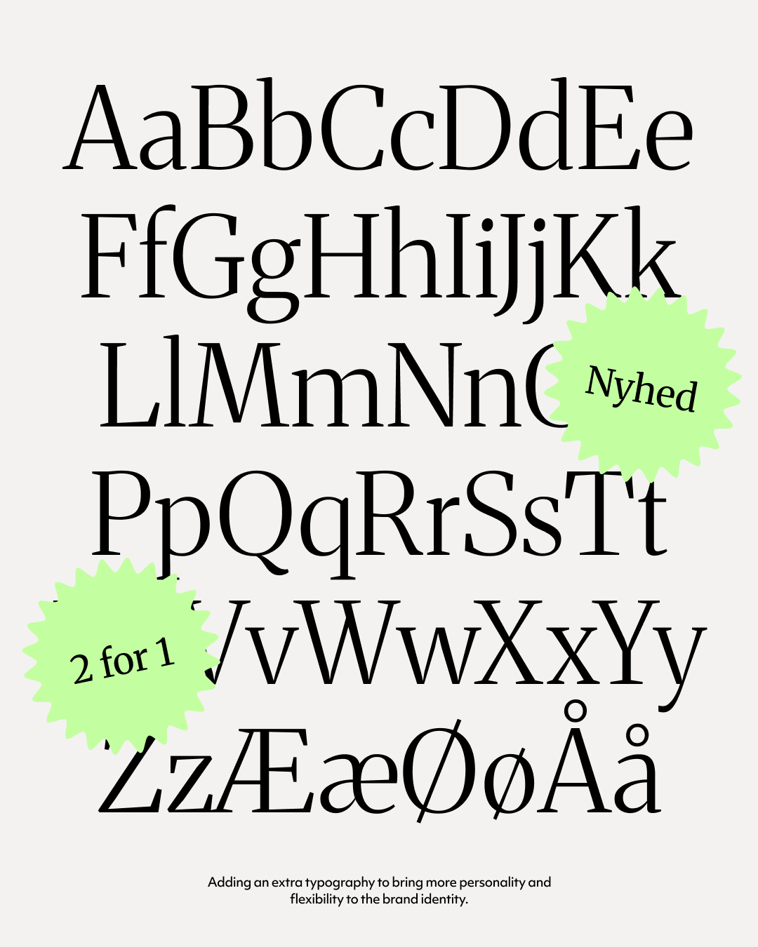
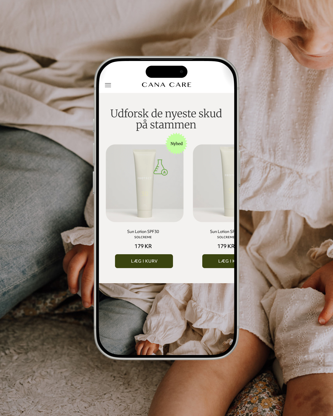
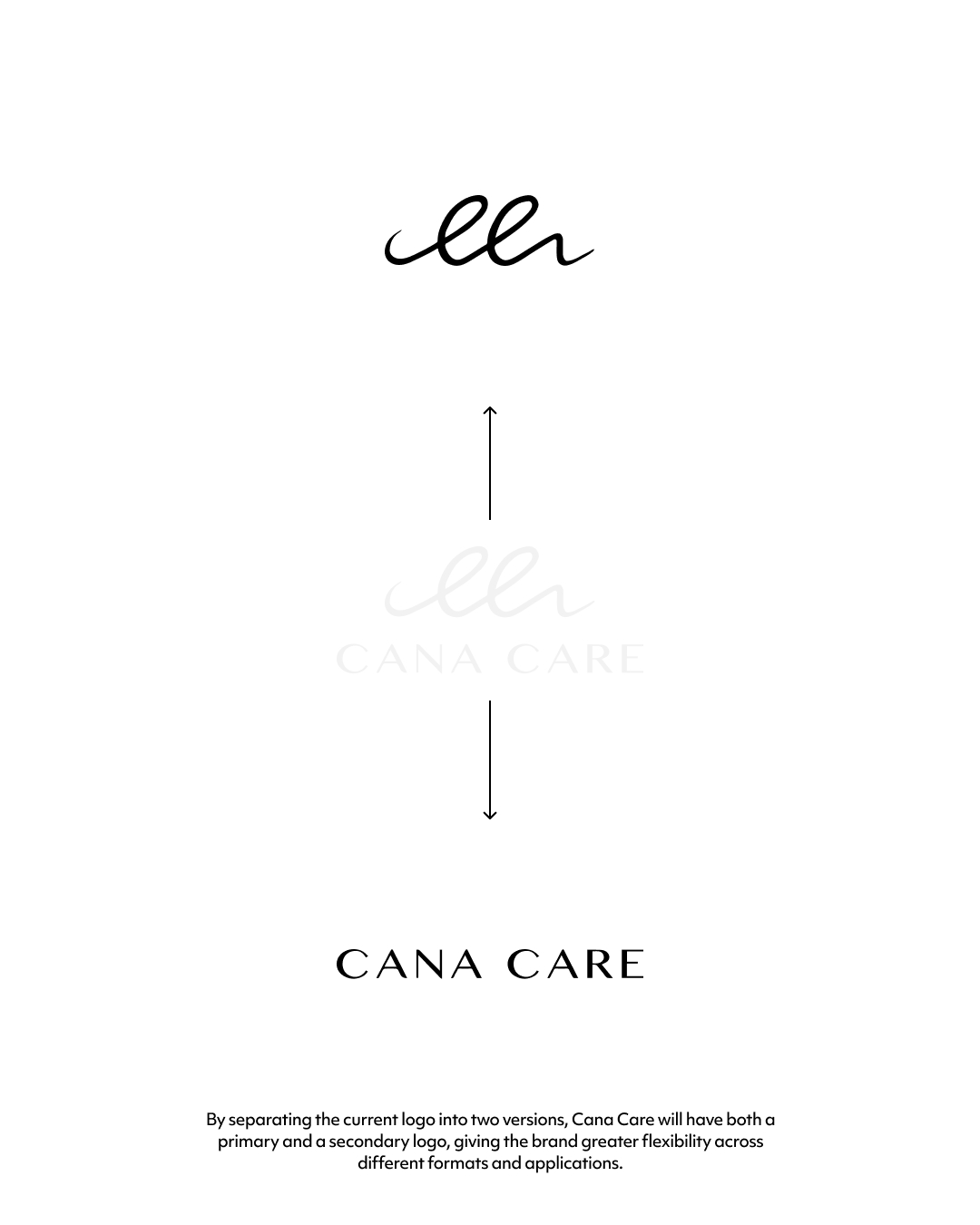
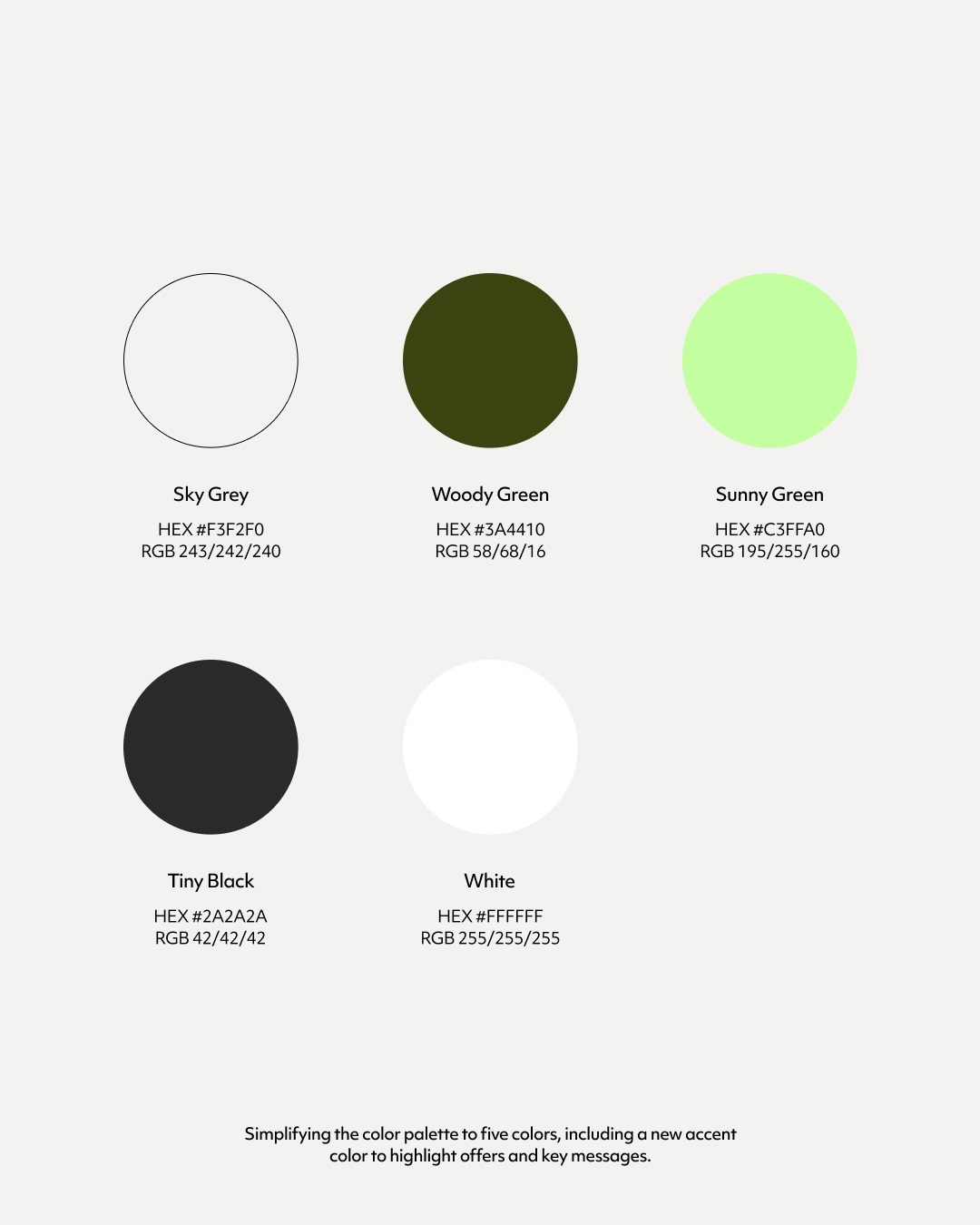
I refreshed the identity with a new colour palette, expanded typography system and a more flexible logo suite featuring primary and secondary versions.
A refined identity with more personality, flexibility and room to evolve.
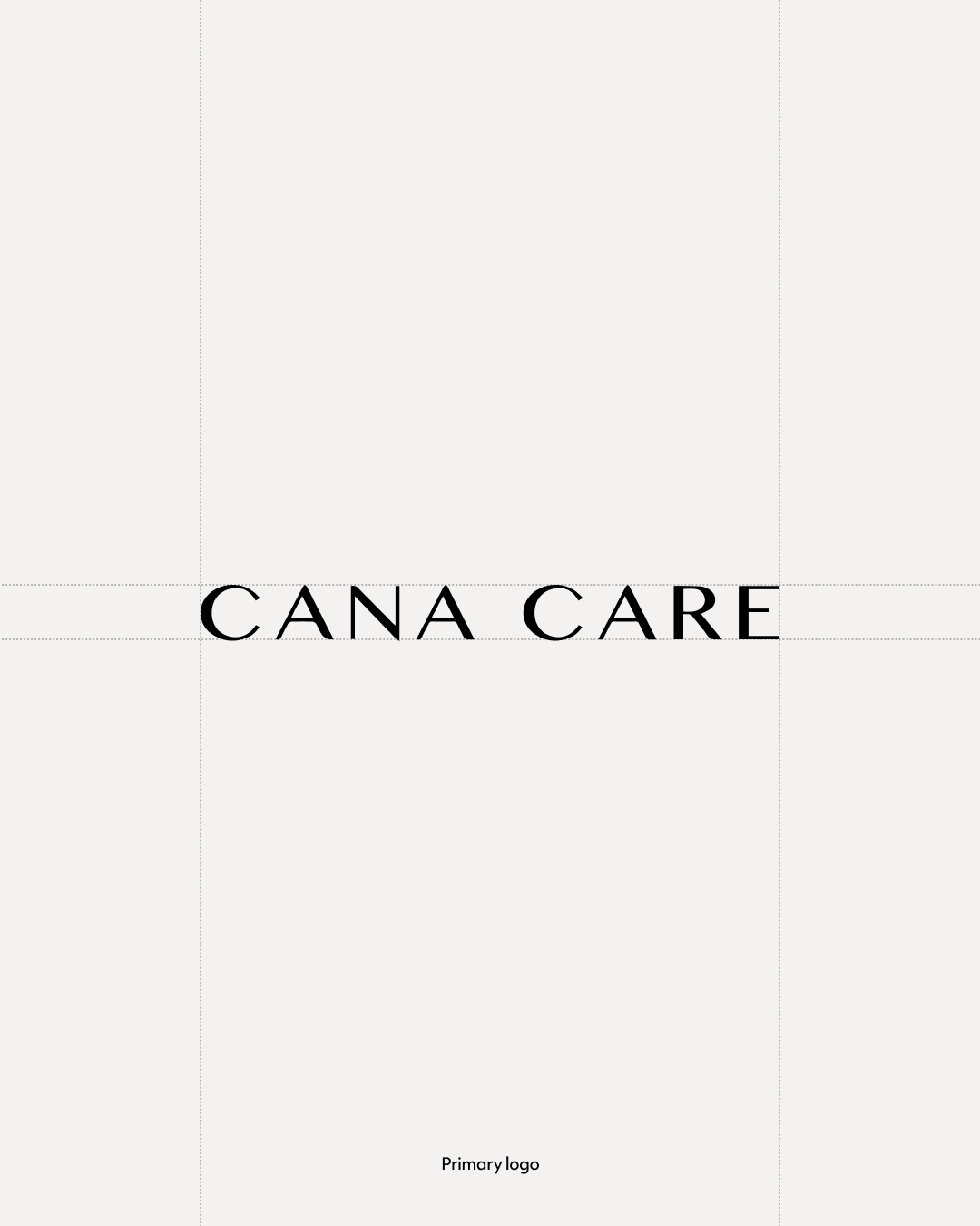
Logo system
Typography system
Color system